Sales Page Template: A Proven Formula to Boost Conversions
A high-converting sales page template is more than just a pretty design. It's your strategic blueprint, a carefully constructed framework built to guide visitors from a casual "just looking" to an enthusiastic "take my money!"
Think of it as your best salesperson, one who never sleeps, never takes a day off, and works 24/7 to close deals for you.
Your Blueprint For A High-Converting Sales Page
Ever stared at a blank screen, knowing you have a killer product but having no idea how to translate that into a page that actually makes sales? You're not alone. The secret isn't just about flashy graphics or clever copy; it's about having a proven structure that hits all the right psychological triggers.
Your sales page needs to grab your customer by the shoulders, look them in the eye, and show them you understand their biggest problem—and that you hold the one true solution.
It works just like a physical storefront. In the real world, mastering store signage design as a silent salesperson is what makes a customer walk through the door instead of walking past. Your sales page has the exact same job: communicate massive value in a split second.
This guide goes beyond fluffy theory. We're breaking down the actionable frameworks for every single piece of the puzzle, so you can build a page that not only looks great but performs even better.
The Core Conversion Funnel
The path from a curious visitor to a paying customer isn't random. It follows a predictable psychological journey, and your sales page has to lead the way.
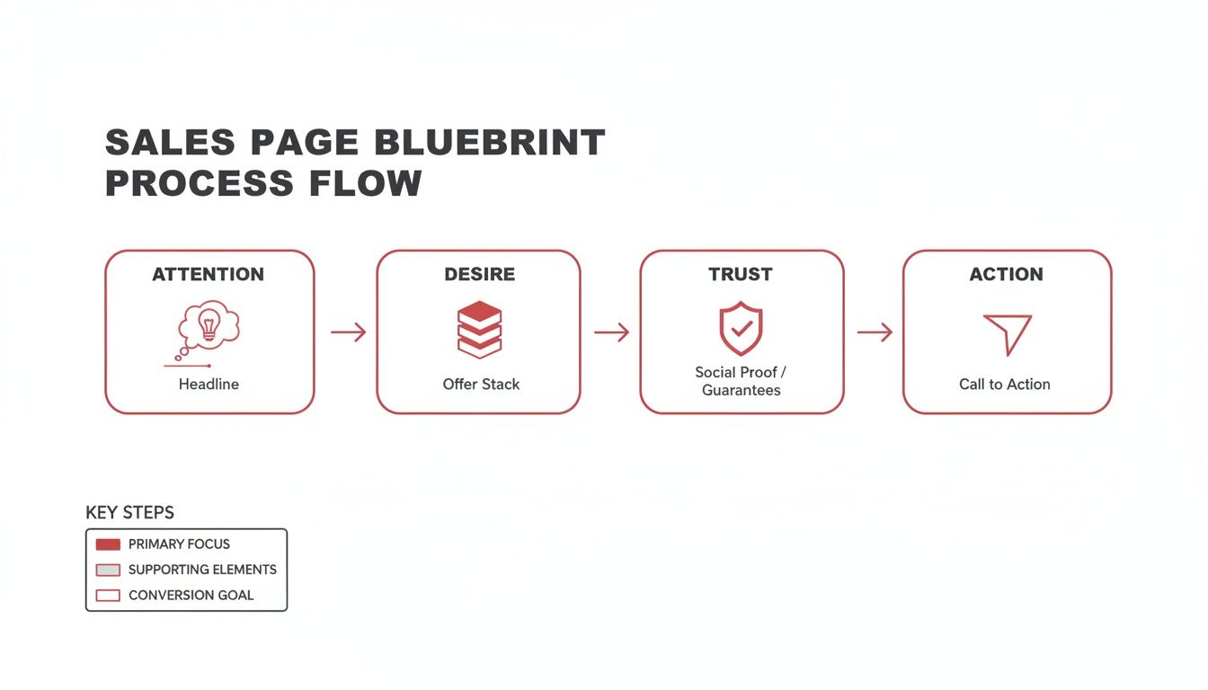
As you can see, a successful sales page isn't just one big sales pitch. It's a sequence of persuasive steps, each building on the last to move your prospect from awareness to action.
Before we dive into the nitty-gritty of each section, let's get a high-level view of the essential building blocks. Every winning sales page is built on these core components.
Core Components of a Winning Sales Page Template
Component | Purpose | Key Objective |
|---|---|---|
Headline & Sub-headline | Capture immediate attention | Make the visitor stop scrolling and want to learn more. |
Hero Section | Create an emotional connection | Show the "after" state and build instant desire for the solution. |
Irresistible Offer Stack | Justify the price and value | Present the product and bonuses as an absolute no-brainer. |
Powerful Social Proof | Build trust and credibility | Eliminate skepticism with testimonials, case studies, and results. |
Clear Call-to-Action (CTA) | Drive the final conversion | Guide the visitor to take the next step without hesitation. |
Each of these elements plays a critical role in persuading your visitor. Getting them right is the difference between a page that flops and a page that fuels your business growth. Now, let's break down how to nail every single one.
Crafting Headlines That Stop The Scroll
Let's be blunt: your headline is the most valuable piece of real estate on your entire sales page. Statistics don't lie—on average, 8 out of 10 people will read your headline, but a measly 2 out of 10 will bother with the rest. If your headline doesn't grab them by the collar, the rest of your page might as well be invisible.
It’s time to move past fluffy, generic advice and get into what actually works. The goal here is simple: make a specific, powerful promise that speaks directly to your ideal customer’s biggest frustration or deepest desire. Vague headlines get scrolled past. Specific, benefit-loaded headlines get clicks.
Your headline has one job: to immediately answer the visitor's unspoken question, "What's in it for me?" It needs to be crystal clear, compelling, and spark just enough curiosity to pull them down the page for more.
High-Impact Headline Formulas
Why reinvent the wheel when you can start with a battle-tested engine? Instead of staring at a blank page, lean on proven headline frameworks. These structures are popular for a reason—they tap into core psychological triggers like desire, FOMO, and the promise of an easier path.
Here are a few of my go-to formulas you can adapt right now:
The "How To" Formula: How to [Achieve Desirable Outcome] Without [Common Pain Point]
Real-World Example: "How to Launch Your Online Course in 30 Days Without a Huge Following or Technical Headaches"
The "Specific Promise" Formula: The [Adjective] Guide to [Achieving Specific Goal]
Real-World Example: "The Foolproof Guide to Tripling Your Email Subscribers in 90 Days"
The "Target Audience Callout" Formula: For [Your Audience] Who Want [Desirable Outcome] But [Struggle with Obstacle]
Real-World Example: "For Busy Coaches Who Want to Scale to Six Figures But Are Burnt Out from 1-on-1 Clients"
These frameworks give you a massive head start. For a deeper dive, our guide on the headline construction framework is packed with plug-and-play templates you can swipe today.
A great headline doesn't just describe your offer; it sells the dream. It paints a vivid picture of the reader's future—one where their biggest problem is finally solved. Always focus on the transformation, not just the product itself.
The Role of The Sub-Headline
If the headline is the hook, the sub-headline is what sets it. This is your one-two punch to solidify interest and make your value proposition undeniable. Think of it as the supporting actor that makes the main star shine even brighter.
A killer sub-headline should:
Clarify the big promise from your headline.
Call out your primary audience so they know it's for them.
Hint at the unique method or solution you're offering.
Add a compelling detail or a touch of urgency.
Let's see it in action:
Headline: "Finally Get Your First 1,000 YouTube Subscribers"
Sub-headline: "Our step-by-step video growth system helps new creators build a loyal audience and monetize their channel, even with zero prior video experience."
This combo instantly tells a new creator what's on offer and reassures them that it’s built for their exact situation. When you nail this pairing, you turn a casual browser into an engaged prospect who is eager to find out how you're going to deliver on that promise.
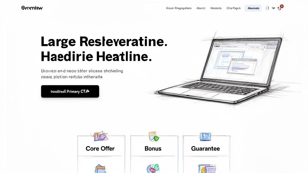
Building Your Hero Section and Offer Stack
The moment someone lands on your sales page, the clock starts ticking. You have maybe three seconds to convince them they're in the right place. That first screen they see without scrolling—what we call the hero section—is your one shot at a great first impression.
This isn't the time for a lengthy backstory. Your visitor has a problem, and they're wondering, "Is the solution here? What's in it for me?" Your hero section has to answer that question, and fast.
A winning formula pairs a strong visual with a direct, compelling promise. Don't just slap a generic stock photo there. Show them something tangible—a clean mockup of your e-book or a slick screenshot of your course dashboard. This simple trick makes your digital product feel real and valuable before they've even read a word.
Marry that visual with the powerful headline you’ve already crafted, and you’ve just delivered on your initial promise.
Constructing an Irresistible Offer Stack
Okay, you've grabbed their attention. Now it's time to build so much value that the price becomes an afterthought. This is where the offer stack comes in. An offer stack isn’t just a boring list of features; it's a strategic showcase of everything your customer gets, framed to make the perceived value sky-high.
You start with your main offer, then you pile on high-value bonuses. The secret sauce is assigning a realistic dollar value to every single item in the stack. This creates a powerful visual anchor that shows the total value is ridiculously higher than what you’re asking them to pay.
Let's say you're selling a social media content calendar template. A weak offer is just the template. A strong offer stack looks more like this:
The 2024 Ultimate Content Calendar: (Value: $97)
BONUS #1: 100+ Viral Video Hooks Cheatsheet (Value: $47)
BONUS #2: The Canva Template Customization Guide (Value: $29)
BONUS #3: Private Community Access Pass (Value: $197)
See what happened? Your simple template is now a complete system. The total perceived value is $370, which makes your actual price of, say, $47 feel like an absolute no-brainer. This completely reframes their mindset from "How much does this cost?" to "Look at everything I'm getting for that price!"
If you want to nail this crucial piece of your page, our Hero Promise Formula Builder gives you a step-by-step framework for defining and presenting your core offer.
The magic of an offer stack is that it reframes the purchase decision. It’s no longer about buying one item; it's about gaining access to a complete solution package where the bonuses alone are worth more than the asking price.
Visually Presenting Your Stack
How your offer stack looks is just as important as what's in it. Whatever you do, don't bury this goldmine of value in a dense paragraph of text. No one will read it.
Instead, use a clean, scannable layout. Think bullet points, checkmarks, bolded values, and clear headings for each component. A simple table or a visually distinct section with a different background color can work wonders here.
By clearly itemizing every single piece—the core product, each bonus, the community access, your guarantee—you make the decision to buy feel logical, emotional, and urgent all at once. This visual clarity is a non-negotiable part of a high-converting sales page.
Leveraging Social Proof To Build Unshakeable Trust
You've just laid out a knockout offer. It's compelling, packed with value, and you know it solves a real problem. But right on cue, your visitor's brain kicks in with one critical question: "This sounds great, but can I actually trust it?"
This is the moment where skepticism can derail the entire sale. It’s the single biggest conversion killer out there, and your job is to dismantle that doubt with overwhelming, undeniable social proof.
People are hardwired to follow the crowd. It's a survival instinct. When they see that other people have already bought—and loved—your product, it feels like a much safer bet. This isn't just a "nice-to-have" feature; it's a core function of any high-converting sales page template.
This powerful effect is why dedicated landing pages are the gold standard for turning visitors into customers. Think about it: the average landing page sees a 6.6% conversion rate, which is a massive 160% improvement over pop-ups or basic sign-up forms that often struggle to convert even 1% of traffic. Why the huge difference? Because a well-structured page gives you the space to build that critical trust with compelling proof. Discover more insights about landing page performance.
Weaving Proof Throughout Your Page
Don't make the classic mistake of lumping all your testimonials into one section at the very bottom of the page. That's old-school thinking. The most effective strategy is to sprinkle different types of social proof throughout your page, placing them exactly where a specific objection might pop up.
Here are a few of the most effective forms of social proof I've seen work time and time again:
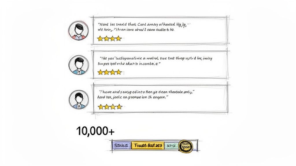
Direct Testimonials: Use quotes that highlight a specific result or help a visitor overcome a common fear. Adding a headshot and full name makes it instantly more believable.
Case Studies: A short "before and after" story showing a customer's journey provides tangible evidence of your product's transformative power.
Specific Numbers: Saying "Join 10,000+ happy customers" is far more powerful than a vague statement like "many people have joined." Specificity builds credibility.
"As Seen On" Logos: If your brand or product has been featured in well-known publications, displaying their logos lends you instant authority and borrows their credibility.
The best social proof feels like a friend giving you a solid recommendation. It’s authentic, specific, and focuses on the emotional outcome just as much as the practical result. Vague praise like "it was great!" does nothing to persuade a skeptical buyer on the fence.
What To Do With No Customers Yet
Starting from scratch? Don't panic. You can still build a huge amount of trust without a long list of customer reviews. The key is to borrow credibility from other sources while you work on building your own.
Here are a few creative ways to establish trust right from day one:
Leverage Your Expertise: Showcase your own credentials, certifications, or personal results. Answer the question: Why are you the expert they should be listening to?
Use Beta Tester Feedback: Offer your product to a small group for free or at a steep discount in exchange for their honest feedback. These initial testimonials are pure gold.
Gather Peer Endorsements: Ask a respected colleague or an influencer in your niche to review your product. Their stamp of approval can be incredibly persuasive for a new audience.
For more advanced strategies, our guide on how to boost your conversions with social proof provides actionable frameworks you can implement immediately. By proactively addressing doubt with authentic proof, you make the decision to buy feel not just smart, but completely safe.
Designing Calls-To-Action That Actually Convert
Look, even the most beautifully written sales page will completely flop with a weak call-to-action. Your CTA isn't just a button—it's the final, critical instruction that turns a curious visitor into a paying customer. This is the moment of truth where all your hard work either pays off or goes down the drain.
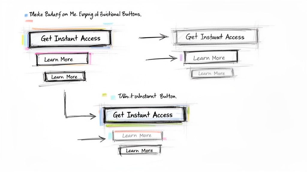
So many creators just slap a generic "Buy Now" button on their page and call it a day. That's a massive missed opportunity. Your CTA copy needs to reinforce the value the customer is about to get. Think action and benefit, not just a command.
Instead of a sterile, transactional button, try painting a picture of the outcome they're about to experience:
"Get Instant Access to All Modules"
"Start My Transformation Today"
"Yes! I Want the Complete Toolkit"
See the difference? This simple shift in language turns the button from a demand for money into an exciting next step. It’s no longer about what they're giving up, but what they're about to gain.
The Psychology of a Clickable Button
The visual design of your CTA button plays a surprisingly huge role in whether people click it. Color, size, and placement aren't just aesthetic choices; they are strategic decisions you make to draw the eye and encourage that final click. The button absolutely must stand out from the rest of your page, usually with a contrasting color that pops.
It needs to be big enough to be easily noticed without being obnoxious, and where you put it is key. You should have a CTA after every single major persuasive section of your page—after the offer stack, after your best testimonials, and again at the very end. The goal is to make sure that the second a visitor feels convinced, the option to act is right there waiting for them.
The data backs this up in a big way. In fact, personalized CTAs have been shown to convert a staggering 42% more visitors than generic ones. This just hammers home how important it is to speak directly to your audience's needs at that critical moment of decision. If you want to dive deeper, check out these powerful landing page statistics.
Your call-to-action is the single most important click you need to earn. Every element on the page—every headline, every testimonial, every bullet point—should be working to lead your visitor directly to that button with confidence and excitement.
A/B Testing Your Way to More Sales
Never, ever assume your first CTA is the best one. The only way to know for sure is to test it. Simple A/B tests can reveal some truly shocking insights. I once ran a test that changed nothing but the button text from "Download Now" to "Get My Free Guide."
The result? A 38% increase in conversions.
That tiny tweak in language—from a generic command to a more personal, ownership-focused phrase—made all the difference. You can start with small, easy tests just like that:
Test the Button Text: Pit a benefit-driven phrase ("Unlock My Potential") against a simple command ("Sign Up").
Test the Button Color: Try a bold, high-energy color like orange against a calmer, more trust-inspiring color like green.
By constantly testing and refining, you turn guesswork into a data-driven process. This kind of optimization is what separates a pretty good sales page from a truly great one that prints money.
You’ve built the perfect sales page. The copy is sharp, the offer is irresistible, and the design is flawless. So, what's next?
A killer sales page is only half the battle. Without a steady stream of the right people seeing it, even the most persuasive page will just sit there, collecting digital dust. Now it's time to shift from creation to promotion, and the key is focusing on traffic quality, not just quantity.
While paid ads and social media definitely have their place, one channel consistently delivers better results for digital products: email marketing. It’s your single most powerful asset for sending a pre-qualified, warmed-up audience straight to your offer.
Don't just take my word for it. Data shows that email traffic pulls in a remarkable 19.3% average conversion rate on landing pages. That blows paid social ads (12.0%) and PPC search (10.9%) out of the water. This means visitors from your email list are roughly 60% more likely to buy than someone who clicked a social media ad.
If you’re serious about getting results like these, it’s worth sharpening your skills with dedicated digital marketing courses that dive deep into these strategies.
Your Pre-Launch Email Sequence
Sending a single "buy now!" email is a rookie mistake and a surefire way to get low conversions. A much smarter approach is to build anticipation with a simple, three-part email sequence. This primes your audience before they even lay eyes on the sales page you worked so hard to build.
Here's a simple framework that works:
Email 1: The Problem. Start by agitating the core pain point your product solves. Share a relatable story and hint that you’ve discovered a powerful solution, but don't give it all away just yet.
Email 2: The Solution. Now, you can introduce your offer as the answer. Briefly outline the transformation it provides and tease a few of the key benefits. Keep them wanting more.
Email 3: The Launch. This is it. Announce that your offer is officially live. Drive a sense of urgency and send them directly to your sales page with a clear, compelling call to action.
This simple sequence transforms your launch from an abrupt sales pitch into a helpful, anticipated event. You're not just selling; you're guiding them toward a solution they already want.
Beyond email, you can lean into authentic content marketing. Create blog posts or social media content that solves a small piece of your audience's problem for free. This builds authority and trust, creating a natural pathway to introduce your paid offer.
When you do this right, the traffic that finally lands on your sales page isn't cold—they're already convinced of your expertise and ready to invest.
Got Sales Page Questions? We've Got Answers
Even with the perfect template in hand, you’re bound to have questions. Here are the most common ones we hear from creators, along with straight-up answers from our experience.
So, How Long Should My Sales Page Actually Be?
Honestly, there’s no magic word count. The real answer? It needs to be as long as it takes to convince someone to buy.
For a simple, low-cost offer like a $17 ebook, a short, punchy page can get the job done. Hit the main benefits, show a little proof, and give them a clear button to click. Simple.
But if you're selling a high-ticket coaching program or a detailed course for $997, you're asking for a much bigger commitment. That means you need more space. You have to build a mountain of value, dismantle every possible objection, and stack up social proof until the investment feels like a no-brainer.
Always let the offer dictate the length, not the other way around.
What's the Single Most Important Part of the Page?
Your headline. Period. But really, it’s the entire hero section—that very first screen people see before they scroll.
You’ve got maybe 3-5 seconds to grab someone's attention and convince them they're in the right place. If that first impression fails to hook them, the rest of your beautifully written page might as well be invisible.
Think of your hero section as the gatekeeper. Its only job is to earn you the right for the visitor to keep scrolling. Nail it, and you’re in the game. Flub it, and they’re gone.
How Many "Buy Now" Buttons Should I Use?
More than one, but they all need to lead to the same checkout page. There's nothing worse than making a ready-to-buy customer hunt for the button.
A smart approach is to place a call-to-action (CTA) button after each major section of your page. Drop one in right after you reveal your killer offer stack. Add another after your most powerful testimonials. And of course, have a final one at the very bottom.
This simple strategy makes it dead easy for someone to say "yes" the exact moment they feel convinced.
Ready to stop staring at a blank page and start converting visitors into customers?
Entrepedia provides a massive library of market-tested templates, ebooks, and courses you can rebrand and sell as your own. Explore our PLR Master Library and launch your next digital product in record time.